
Storefront widgets
Three blocks draw your tier offers on the product page: the Quantity Break Table, the Quantity Break Picker and the Spend More Save More table. You place them once in your theme; after that they follow the discount, showing its tiers and hiding when the offer stops.
-
Turn on Show on storefront in the discount.
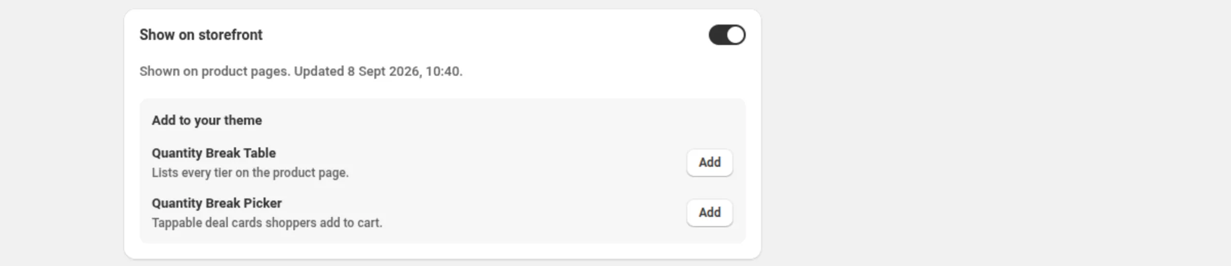
Open the discount — a quantity break, a spend more save more or a price list — and switch Show on storefront on. It is on by default for a new quantity break and a new spend more save more discount. The card’s status line tells you exactly what shoppers will get, or why the widget stays hidden.
-
Click Add next to the block you want.
The Add to your theme panel at the bottom of that card names each block exactly as the theme editor names it, with one line about what it is, and an Add button that opens your theme editor with the block ready to place.
-
Place the block in the theme editor and save.
Drop the block where it belongs on the product page — usually near the price or the buy button — and click Save.
-
Adjust the block’s settings in the theme editor.
Every label, colour and behaviour below is a theme-editor setting on the block itself.
Quantity Break Table
Section titled “Quantity Break Table”Lists every tier of a quantity break offer as a table on the product page: the quantity, what the shopper gets, and the price.
General
Section titled “General”- Border color — the table’s border. Default
#d9d9d9. - Roundness — corner radius, 0–24 px. Default 8.
- Borderless — off by default. On, the border is dropped.
Header
Section titled “Header”- Header background — empty uses the design default.
- Header text — the header’s text colour.
- Cell padding — 4–32 px. Default 14.
- Body background
- Body text
- Highlight unlocked tier — on by default. Highlights the row matching the selected quantity.
- Highlight color — default
#e8f5e9.
Columns
Section titled “Columns”- Display quantities as range — off by default. On, shows “2–4” instead of “2+”.
- Quantity label template — for example
Buy {quantity}+;{quantity}is replaced automatically. Empty keeps “2+”. Ranges are unaffected. - Quantity label — default “Buy”.
- Show savings column — on by default. Always shown for amount-off offers.
- Savings label — default “Get”.
- Off-each label — default “off each”. Used for percentage offers.
- Amount-off label — default “off”. Used for amount-off offers; the amount is the total for the qualifying items, so the default makes a total claim, never a per-item one.
- Fixed-price label — default “each”. Used for fixed-price offers.
- Show prices column — on by default. Hidden automatically for amount-off offers and for products with over 50 variants.
- Price label — default “Price”.
- Show original price — on by default. Crosses out the full price next to each discounted price.
- Show base row — on by default. Adds a full-price row for quantities below the first tier.
Message
Section titled “Message”- Code hint prefix — default “Use code”. Shown only for code discounts.
- Linked message — optional text shown above or below the table.
- Message position — Above or Below. Default Below.
Quantity Break Picker
Section titled “Quantity Break Picker”The same offer as tappable deal cards the shopper picks from and adds to the cart in one go.
General
Section titled “General”- Heading — default “Choose your bundle”.
- Card border — default
#d9d9d9. - Selected accent — border and radio colour of the selected card.
- Roundness — 0–24 px. Default 8.
- Card padding — 4–32 px. Default 14.
- Card background
- Card text
- Show single-item card — on by default. Adds a “Buy 1” card above the tiers.
- Single-item label — default “Buy 1”.
- Pre-selected tier — 0–10. Default 0, which keeps the default selection. Counts only tiers that actually show, so a hidden tier is never pre-selected.
- Tier label — default
Buy {quantity};{quantity}is replaced automatically. - Off-each label — default “off each”. Used for percentage offers.
- Amount-off label — default “off”. Used for amount-off offers, as a total claim.
- Fixed-price label — default “each”. Used for fixed-price offers (per-item price).
- Per-product suffix — default “of the same product”. Shown when the offer counts per product.
- Per-variant suffix — default “of the same variant”. Shown when the offer counts per variant.
- Show unit prices — on by default. Hidden automatically for amount-off offers and products with over 50 variants.
- Show original price — on by default. Crosses out the full price above each discounted price.
- Each label — default “each”.
- Most popular tier — 0–10. Default 0 = no tag; 1 = the first tier.
- Most popular text — default “Most popular”.
- Most popular background — default
#1a1a1a. - Most popular text color — default
#ffffff.
Button
Section titled “Button”- Button text — default “Add to cart”.
- Added text — default “Added!”.
- Unavailable text — default “Unavailable”.
- After adding to cart — Go to the cart page (the default), Refresh the page (so the theme shows the new cart count) or Stay on this page (shows a confirmation with a link to the cart).
- In-cart text — default
{count} in cart. Shown after adding while staying on the page;{count}is how many of the added items are in the cart. - Cart link text — default “View cart”.
- Button background — default
#1a1a1a. - Button text color — default
#ffffff.
Message
Section titled “Message”- Code hint prefix — default “Use code”. Shown only for code discounts.
- Linked message — optional text shown above or below the cards.
Bundle composer
Section titled “Bundle composer”- Let shoppers mix variants per tier — off by default. On, the selected tier shows one row per item so shoppers compose the bundle. Not shown for per-variant offers.
- Bundle button text — default “Add bundle”.
- Items word — default “items”. Used when a money total cannot be shown: “Add bundle • 3 items”.
- Unresolved text — default “Choose options”.
- Message position — Above or Below. Default Below.
Spend More Save More
Section titled “Spend More Save More”Lists every spend tier of a spend more save more offer on the product page: spend this much, get that much off.
General
Section titled “General”- Border color — default
#d9d9d9. - Roundness — 0–24 px. Default 8.
- Borderless — off by default.
Header
Section titled “Header”- Header background — empty uses the design default.
- Header text
- Cell padding — 4–32 px. Default 14.
- Body background
- Body text
- Highlight unlocked tier — on by default. Highlights the highest tier the cart has reached.
- Highlight color — default
#e8f5e9.
Columns
Section titled “Columns”- Spend label — default “Spend”.
- Savings label — default “Get”.
- Off-the-order label — default “off the order”.
- Off eligible items label — default “off eligible items”. Used instead of the off-the-order label when the discount excludes some items.
Message
Section titled “Message”- Code hint prefix — default “Use code”. Shown only for code discounts.
- Linked message — optional text shown above or below the table.
- Message position — Above or Below. Default Below.
Custom theme selectors
Section titled “Custom theme selectors”Sale Badges and Price Drops find their spot in your theme automatically. On a theme where that does not work, Theme selectors on the Promotions page opens a modal with three optional CSS selectors that point the app at your theme’s own elements:
- Badge container in product cards — the element inside each product card where badges pin. One entry covers every page that shows product cards.
- Price element on the product page — the element holding the price on a product page, where the discounted price shows.
- Price element in product cards — the element holding the price inside each product card.
Leave a field empty to keep automatic placement. Each selector is at most 200 characters and must be a valid CSS selector — the field says so inline if it is not. A selector that matches nothing falls back to automatic placement, and a selector that holds no price paints nothing rather than crossing out a wrong number.
How it shows to the shopper
Section titled “How it shows to the shopper”Each block renders on the product page in the spot you placed it, with the offer’s real tiers. The picker also adds to the cart. When the offer does not cover the product in front of the shopper, or the offer is paused or over, the block shows nothing instead of a stale claim.
Limits and notes
Section titled “Limits and notes”- One widget per product. Where two display-enabled offers cover the same product, only one widget shows there. The discount’s Show on storefront card counts them and offers Choose which one shows. Every discount still applies on its own terms.
- Prices hide over 50 variants. The price column and the picker’s unit prices are hidden automatically for amount-off offers and for products with more than 50 variants.
- Pausing the offer hides the widget — the card then reads “Not shown (offer paused)” and no longer offers the switch, so a paused offer can never look live.
- The display switch is display only. Turning Show on storefront off hides the widget; the discount keeps applying. To stop the discount, pause the offer.
- Theme selectors are shop-level, not per promotion: saving them changes placement for every Sale Badge and Price Drop on the store.
Related
Section titled “Related”- Cart goal bar — the fourth block, showing progress toward the next spend tier.
- Quantity break — the discount behind the table and picker.
- Spend more save more — the discount behind the spend table.
- Price list — the other discount that feeds the tier table.
- App embed — needed for badges and price drops, not for these blocks.