
Cart goal bar
The Cart Goal Bar turns a spend more save more offer into one line and one bar: how much more to spend, what that unlocks, and a mark for each tier along the way. It fills as the shopper’s cart grows.
-
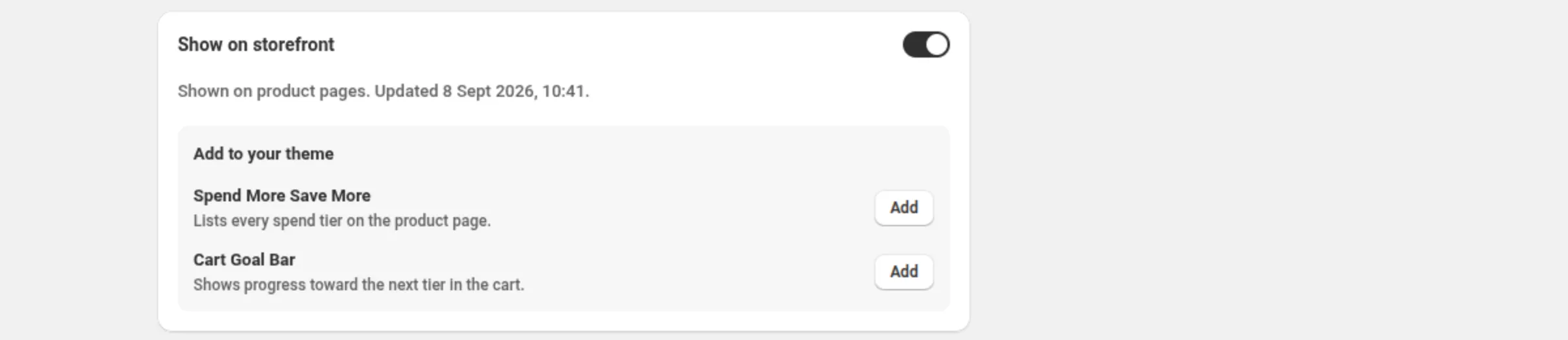
Turn on Show on storefront in the spend more save more discount.
Open the spend more save more discount and switch Show on storefront on. It is on for a new discount.
-
Click Add next to Cart Goal Bar.
In the Add to your theme panel on that card, the Cart Goal Bar row reads “Shows progress toward the next tier in the cart”. Its Add button opens your theme editor with the block ready to place.
-
Place the block in the theme editor and save.
Put the block where shoppers should see their progress, then click Save.
-
Set the bar’s colours and wording.
Everything below is a theme-editor setting on the block.
Settings
Section titled “Settings”- Track color — the unfilled part of the bar. Default
#e5e5e5. - Fill color — the filled part. Default
#1a1a1a. - Unlocked color — used once the top tier is reached. Default
#2e7d32. - Text color — the line above the bar.
- Bar height — 4–32 px. Default 10.
- Roundness — 0–24 px. Default 8.
- Show amounts under the bar — off by default. Shows spent and the next threshold.
Wording
Section titled “Wording”- Goal text — default
Spend {amount} more to get {percent} off.{amount}and{percent}are replaced automatically. - Unlocked text — default
You’ve unlocked {percent} off! - Tier mark colour — default
#ffffff. Marks not yet reached; a reached mark uses the unlocked colour. - Tier mark shape — Circle (default) or Square.
- Tier mark size — 6–28 px. Default 14.
- Show tier amounts under the bar — off by default, because labels can overlap on narrow screens.
- Tier reached text — default
You've got {current} off. Spend {amount} more to get {percent} off. Shown once a tier is reached and another one remains;{current},{amount}and{percent}are replaced automatically. - Code hint prefix — default “Use code”. Shown only for code discounts.
- Static text — default
Spend {amount} to get {percent} off. Used when progress cannot be measured. - Static text with excluded items — default
Spend {amount} to get {percent} off eligible items. Used instead of the static text when the discount excludes some items.
Examples
Section titled “Examples”A quiet bar in your brand colours
Fill color: #1a1a1aUnlocked color: #2e7d32Bar height: 10Roundness: 8Show amounts under the bar: offA loud bar that names every tier
Bar height: 16Tier mark shape: SquareTier mark size: 18Show tier amounts under the bar: onGoal text: Only {amount} more for {percent} offHow it shows to the shopper
Section titled “How it shows to the shopper”While the app can measure the cart, the line counts down — “Spend $20 more to get 15% off” — and the bar fills toward the next mark. Once a tier is reached and another one remains, the line switches to the Tier reached text; at the top tier it switches to the Unlocked text and the bar takes the unlocked colour. Marks are drawn for up to 6 tiers.
When progress cannot be measured, the block states the offer with the Static text instead — never a progress claim it cannot stand behind. The discount itself is unaffected either way: Shopify checks the cart and applies it when the cart qualifies.
For a code discount, the Code hint prefix is shown so the shopper knows a code is needed.
Limits and notes
Section titled “Limits and notes”- Tier marks are drawn for up to 6 tiers. Beyond that the bar still fills and the wording still counts down; only the marks are dropped.
- Bar height 4–32 px · Roundness 0–24 px · Tier mark size 6–28 px.
- Conditions and exclusions can turn off live progress. When the offer’s rules mean the app cannot measure the qualifying part of the cart, the block falls back to the static wording. The discount’s Show on storefront card says which case applies.
- Pausing the offer hides the bar, and the card says so rather than leaving a live-looking switch.
- No app embed needed. The block renders on its own.
Related
Section titled “Related”- Spend more save more — the discount behind the bar.
- Storefront widgets — the other three theme blocks.
- App embed — needed for badges and price drops, not for blocks.